Lone Peak Cannabis Co.
Lone Peak Cannabis Co. enlisted our team at Outlaw Partners to lead their brand refresh. Formerly known as 'Lone Peak Caregivers,' the owner aimed to elevate the company's profile, expanding from its original Big Sky location to three new ones in Ennis, Bozeman, and West Yellowstone.
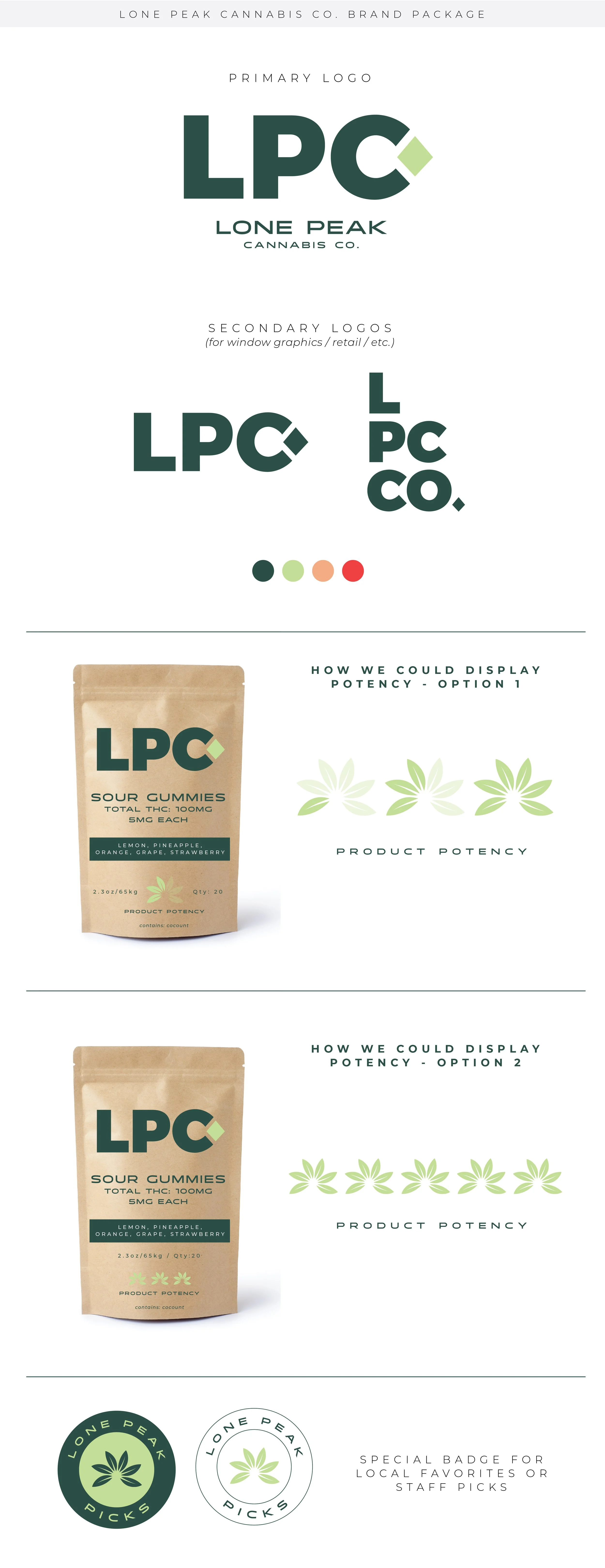
Given the nature of the cannabis industry, the client expressed a desire to explore various shades of green for the brand. Additionally, they were inspired to incorporate a ski resort terrain theme, using a diamond motif to symbolize 'expert level' and connote superior product quality and expertise. It was imperative that the logo maintained a clean look and could adapt seamlessly to diverse packaging and product offerings. The client also welcomed the idea of unique sub-marks and patterns to add further creative depth.
With a high-quality, 100% organic medical product as the foundation for their vision, LPC has since been providing marijuana products to the Big Sky community through a growing process that mimics what the Earth already provides naturally. Their state-of-the-art greenhouse facility imitates outdoor growing conditions year-round with an eye toward sustainability. lonepeakcannabiscompany.com
This was LPC’s logo prior to their branding refresh.Mood Board.This section displays the final logo package for Lone Peak Cannabis Co. The client ended up choosing the logo design I created, but also loved the leaf element my teammate ME Brown designed. We decided to use this leaf icon as part of the final branding package as a design element. Additional deliverables such as web ads and graphics, social media assets, merchandise, and signage were created with this brand package after I left the company. Photos from lonepeakcannabiscompany.comSeasonal magazine advertisements I created.


